


New product, fresh idea. Packaging design for the Müller brand.
Branding
Design Strategy
Packaging Design

Project Overview
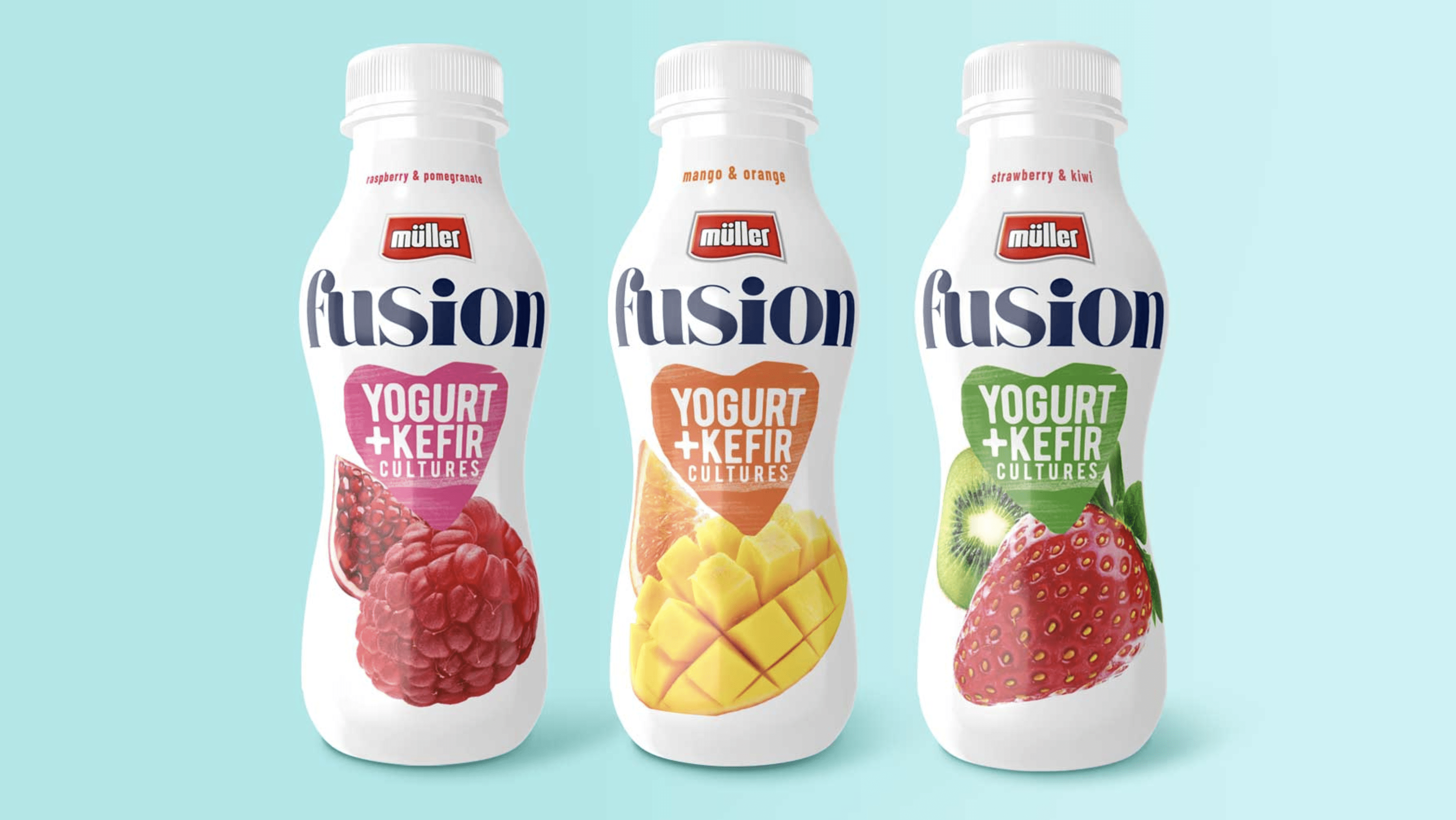
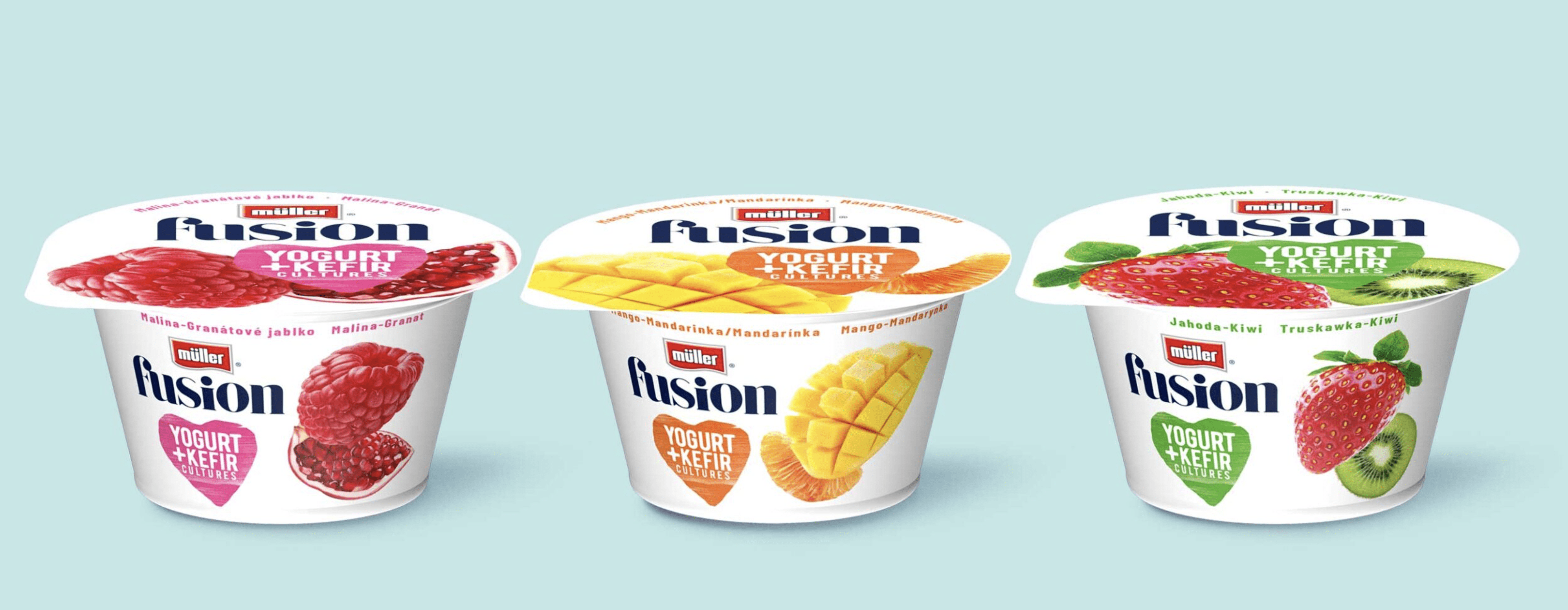
A fusion of tasty solutions When preparing branding and packaging design solutions for the new Fusion sub-brand, we focused on creating an eye-catching branding product that reflects the nature of the product. We were looking for graphic solutions that would adequately reflect the full taste, freshness and health-promoting nature of the drink. We achieved this by referring to what is most important in Müller – milk. The white, minimalistic packaging is distinguished by a juicy product demo, and the selected logotype font, like the product itself, combines noble tradition with modernity. The result is a design firmly embedded in the category and standing out against the background. Light and serious at the same time, white and colourful, and most importantly – communicating the taste and the main advantages of the product well. You have to try this!Client
MüllerTags
branding
packaging
design
creative concept
dairy
photography
strategy
hello@agencyspotter.com417 12th St W Suite 110, Bradenton, FL 34205 USA© 2012-2026 Agency Spotter LLC